Navigating government websites can often be a dense, overwhelming, and sometimes confusing experience. Users frequently encounter challenges in performing basic tasks due to unclear or outdated design.
Enter the United States Web Design System (USWDS), created in 2015 as a direct response to user confusion. USWDS is a design system made up of a comprehensive set of guidelines, principles, components, and tools aimed at creating accessible, mobile-friendly, and user-centric government websites. Design systems like USWDS are used by a wide range of organizations across various industries. A design system provides a unified user interface (UI) and user experience (UX), promoting consistency and efficiency by offering a strategic approach to design.
The Benefits of Using USWDS for Federal Websites
The benefits of using USWDS for federal websites are extensive. By providing standardized design principles and components, USWDS ensures a cohesive user experience for citizens. Its focus on accessibility means government information is accessible to all users, including those with disabilities, fostering inclusivity. Additionally, USWDS improves efficiency by offering pre-designed and tested components, reducing development time and costs for agencies. Its responsive design principles ensure websites function seamlessly across various devices, accommodating the diverse needs of users. Overall, USWDS helps government agencies build and maintain user-friendly, secure, and compliant websites that effectively serve the public.
Adoption of USWDS: Progress and Challenges
Despite the endless advantages already mentioned, not every government agency has implemented USWDS. To modernize agency websites, the federal government enacted the 21st Century Integrated Digital Experience Act aka the 21st Century IDEA. This is a federal mandate aimed at improving the digital experience for users interacting with federal agencies. This law promotes the modernization of digital government services using USWDS tools and guidelines.
Today, approximately 200 sites have adopted USWDS principles, but with over 10,000 .gov websites, significant work remains. It is crucial for designers and contractors to strive towards adapting these principles. Implementing a visual language that signals to users they are interacting with the government is an essential goal of the USWDS.
As a designer, the challenge lies in how to take a design system and infuse it with creativity. How can USWDS be tailored to meet the specific needs of diverse users? Fortunately, USWDS is highly customizable. Many organizations have creatively adapted USWDS to their unique needs, from data-centric dashboards to dynamic and engaging user interfaces. Each site adapts USWDS’s foundational principles to enhance usability, accessibility, and aesthetic appeal.
Case Studies: The White House and IRS Website
To illustrate how different organizations leverage USWDS, let’s examine the websites of the White House and the IRS. These high-traffic sites were among the first to undergo an overhaul with USWDS principles in mind.
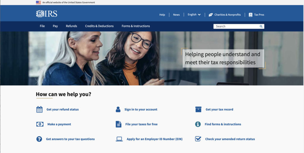
The IRS website heavily relies on the USWDS framework to maintain a standardized and functional design. It emphasizes clarity, simplicity, and accessibility, ensuring users can easily find and understand tax-related information. The focus is on task-based navigation with a clean, professional layout, minimizing visual distractions to help users perform essential functions such as filing taxes and accessing forms.

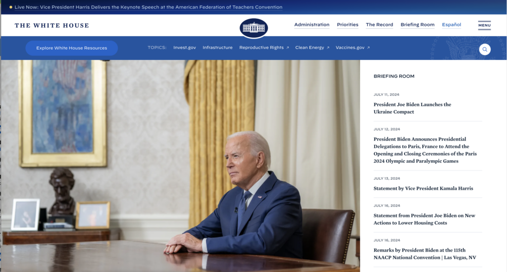
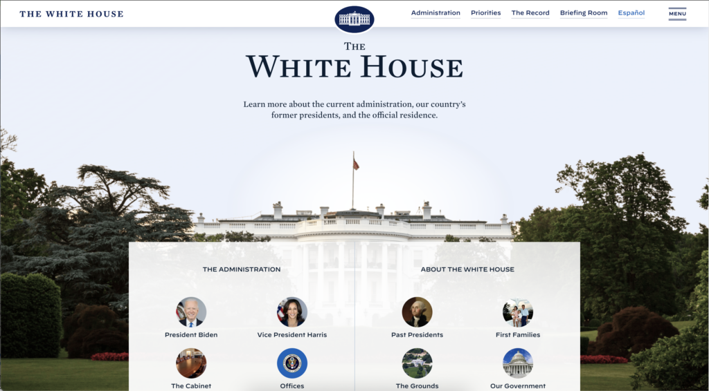
In contrast, the White House website, while also based on USWDS, incorporates more customization to reflect the administration’s branding. This includes dynamic visuals and thematic elements that convey authority and engagement. The site balances functionality with a design that showcases the official and ceremonial aspects of the presidency, offering a visually engaging and content-rich platform.


Both websites effectively use USWDS to meet their distinct needs. The IRS focuses on functionality and ease of access to financial information, providing a streamlined user experience for tasks related to taxes and regulations. Meanwhile, the White House emphasizes visual appeal and dynamic content delivery to engage and inform the public about the administration’s activities and policies.
Implementing USWDS: A Designers’ Perspective
As a UX/UI Designer for a government agency, a significant part of my role involves modernizing my organization’ website using USWDS principles. Let’s look at a few ways in which I can implement these daily.
- Understand USWDS and its Goals: When I first entered the world of government contracting, I had no idea what USWDS was. To design for the government and its citizens, you must understand accessibility, consistency, and responsive design. These principles are at the heart of USWDS and guide all my design decisions.
- Use USWDS Components and Patterns: As pages are redesigned and revamped, I consistently consult the USWDS component library, which includes buttons, forms, navigation, and more. This ensures that the design adheres to USWDS standards and maintains a cohesive look and feel.
- Customize USWDS Components: By pulling from the library, elements are already designed, and I just customize them to fit the branding of my organization. This customization allows the design to meet specific needs while staying within the framework of USWDS.
- Always Be Evaluating: It is important to continuously identify areas where USWDS can be integrated. I determine which components and patterns from USWDS will replace or enhance current elements. Implementing USWDS is not a one-time task but an ongoing process that requires regular assessment and updates.
Embracing USWDS for a Better Digital Future
An ongoing commitment to modernizing digital experiences not only enhances usability for citizens but also ensures that government websites are accessible, efficient, and compliant with federal standards. By embracing USWDS, we are not just improving website aesthetics; we are building trust, fostering inclusivity, and ensuring that every citizen can seamlessly access the information and services they need.
The journey to modernize is continuous and requires regular assessment and adaptation. As designers, developers, and stakeholders, we must remain vigilant in our efforts to enhance user experiences, pushing the boundaries of innovation within the framework of USWDS.
Join RIVA in the mission to transform government websites. Whether you’re a designer, developer, or agency leader, your involvement is crucial. Embrace the principles of USWDS in your projects, share your success stories, and collaborate with others to create a more accessible, user-friendly digital government. Together, we can make a significant impact on how citizens interact with their government online. Let’s make government websites not just functional, but exceptional. Reach out if you’d like to learn more about RIVA’s approach to implementing USWDS for federal websites.


